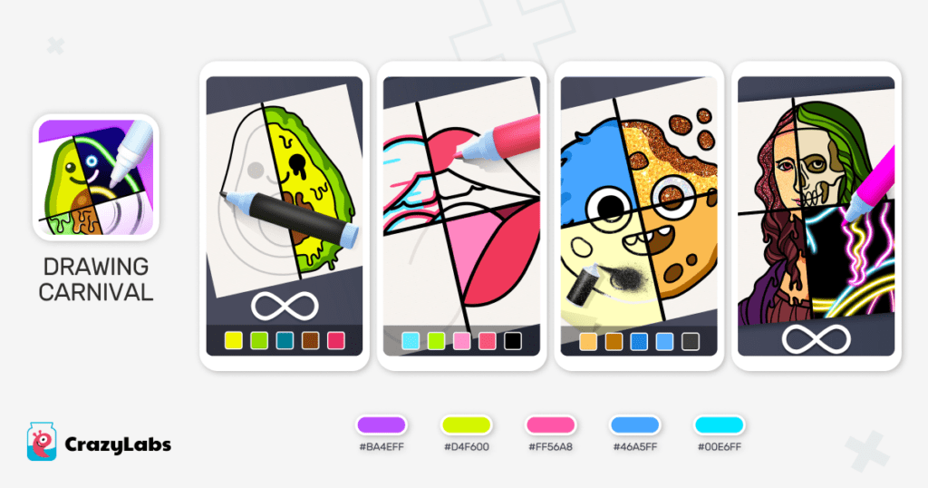
Ensuring an optimal color palette for your hybrid & hyper-casual game is crucial, as it can significantly impact your game’s performance.
First and foremost, color palettes play a vital role in conveying important information within hybrid & hyper-casual games. For instance, distinct colors like red, green, and blue can signify interactive objects, obstacles, power-ups, or progress. This clear communication aids players in quickly understanding the game, a fundamental value in hyper-casual games.
Failing to employ appropriate contrasting colors in your game can make it challenging for players to differentiate between the key elements of gameplay like main character, action scene, background and obstacles with enemies to avoid confusion and frustration.
Furthermore, color palettes help establish a visual hierarchy in hyper-casual games. By assigning specific colors to various elements such as obstacles or rewards, developers can direct players’ attention and highlight essential aspects of the gameplay.
Ultimately, utilizing correct colors in game design can contribute to the creation of better games. Below, is CrazyLabs’ guide on mastering color palettes in hyper-casual & hybrid games, as shared by CrazyLabs’ Creative Team.
CrazyLabs’ Best Practices For Choosing Colors
Use Vibrant and Cartoonish Colors
Hyper-casual games often target a wide demographic. By employing vibrant and cartoonish colors, you can potentially appeal to and captivate a broader audience. The reason behind this is that these colors evoke a sense of playfulness and fun, attracting players of all ages. Additionally, the use of lively colors can stimulate positive emotions, contributing to a memorable gaming experience.
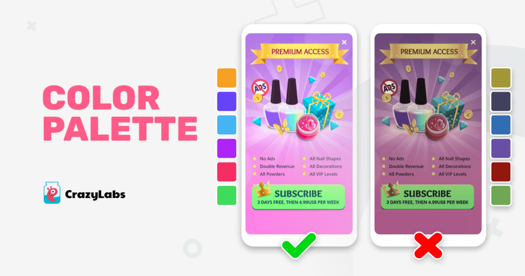
Master Lighting to Enhance Color Impact
While selecting the perfect color palette is crucial, it is equally important to pay attention to lighting within your game scenes. Incorrect lighting can obscure colors, making them appear dirty or dark, even if they seem vibrant on the color panel. Carefully consider how lighting interacts with your chosen colors to ensure they remain vivid and visually appealing.
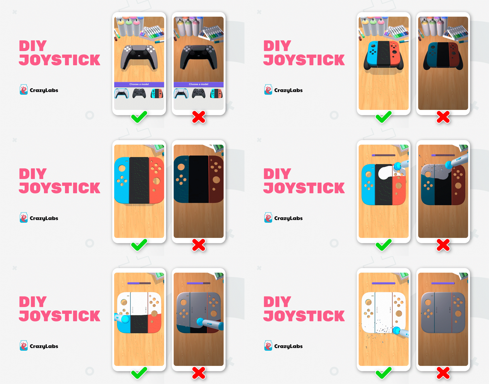
Highlight Key Elements Through Clear Contrasting Palettes
To ensure that essential elements of gameplay receive maximum attention, it is advisable to utilize clear contrasting color palettes. By strategically designing backgrounds and main actions, or backgrounds/platforms and characters with contrasting colors, you can create visual focal points. This contrast enables players to instantly identify critical gameplay elements, enhancing clarity and gameplay comprehension.
Make Sure to Use the Two Most Important Colors Correctly:
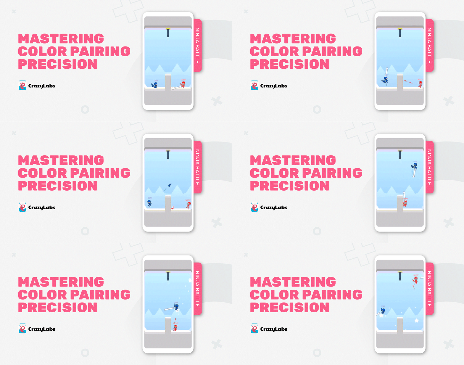
Red As The Color of Challenges and Opposition: When it comes to enemies, opponents, or main obstacles in your game, red is a powerful choice. Its vibrant and intense nature immediately captures attention and signifies danger or difficulty. Utilizing red strategically can heighten the sense of urgency and create a thrilling gaming experience. This is exemplified in the game Ninja Battle below, where the opponent is red:
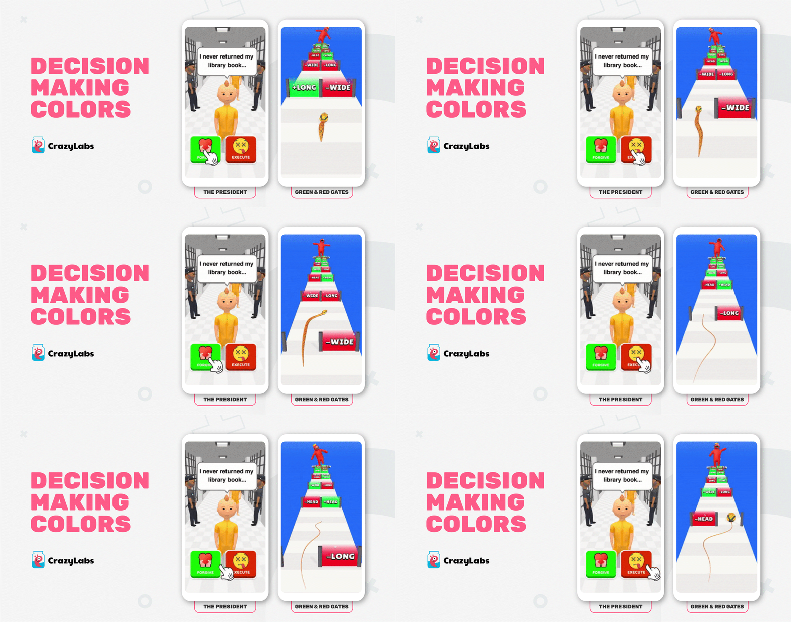
Green and Red to Guide Decision-Making: Using green to highlight favorable choices and red to denote bad decisions provides clear visual cues. This color system simplifies the decision-making process, allowing players to make informed choices swiftly. By leveraging these contrasting colors, you enable players to navigate through challenges with ease. This is exemplified in the runner game, Snake Run Race.
This is also common in narrative games like The President where we use green and red colors to highlight the good or bad decisions.
CrazyLabs’ Approach for Selecting Colors in CrazyLabs’ Games
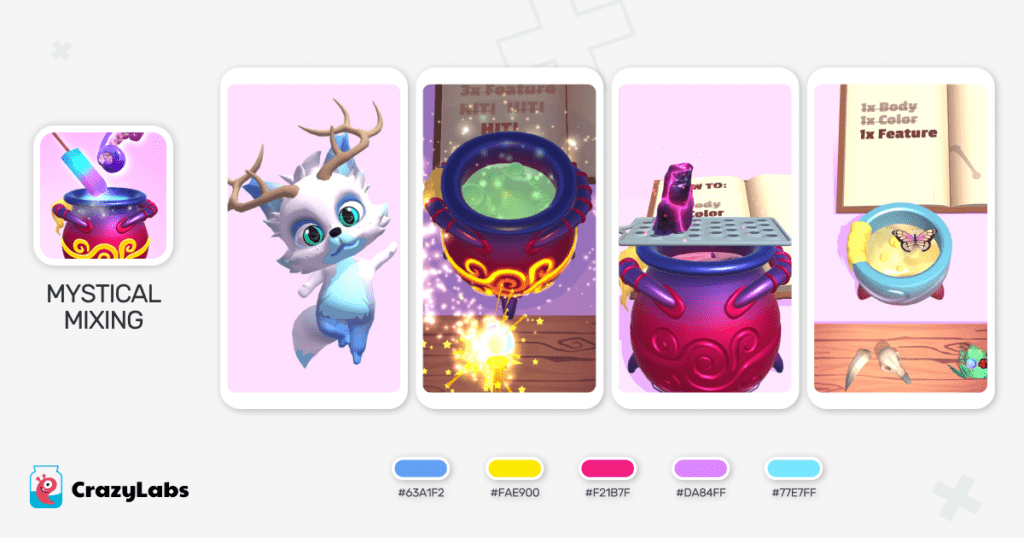
- Mystical Mixing, one of CrazyLabs’ top hits released in 2022, utilizes an abundance of purple shades as it embodies mystery, creativity, and imagination. In the game’s simulation aspect, players have the opportunity to create a creature using various items of their choice. This allows for ample room to imagine how a creature with butterfly wings and diamonds, for example, would turn out.

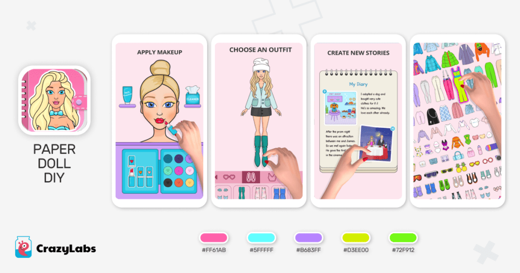
- Paper Doll DIY, one of CrazyLabs’ top hits that came out of the CrazyHubs, enables the player to dress a paper doll. Pink was chosen as the primary color for this game as it champions femininity, friendlessness and evokes emotion.

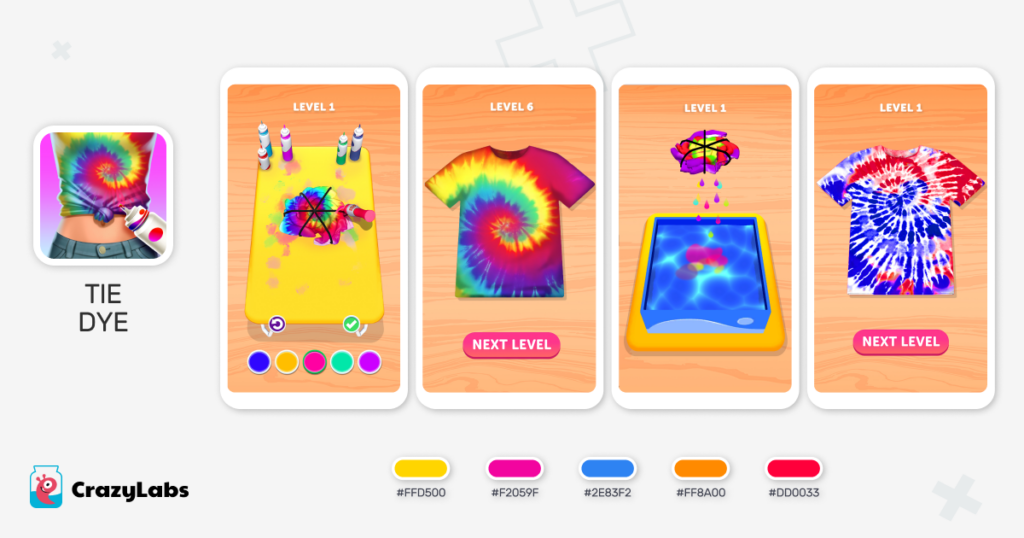
- Tie Dye, one of CrazyLabs’ top hits to date, enables the player to tie dye a variety of clothing. The game’s primary color is yellow, and the reason for this as it conjures up happiness, fun, while connecting old to the new. Tie dying is an activity that many people grew up doing, and so it’s a nice touch of nostalgia.

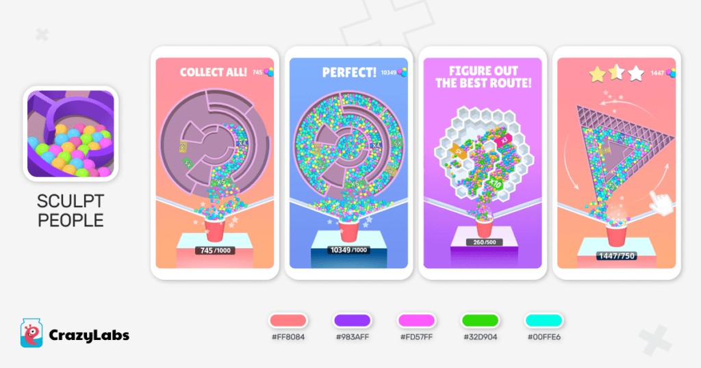
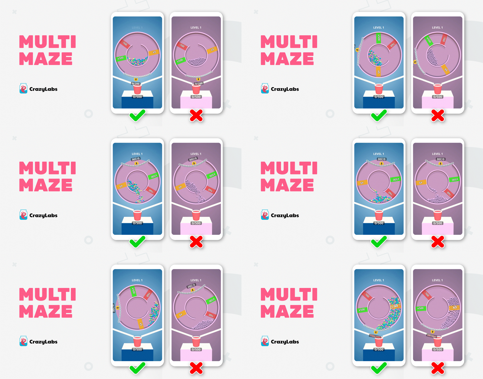
- Multi Maze is one of CrazyLabs’ most successful puzzle games. In this game, we utilized soft pastel colors for the background and maze. This helps focus on the bright, colorful balls, which highlight their satisfying effect when they fall down. The intention was to avoid any visual conflict between the maze and the balls. The color of the balls clearly signifies that they are the main element of the game.

- Drawing Carnival features a wide variety of colors. However, each color is carefully chosen to match the others, ensuring a cohesive and visually pleasing experience. We maintain a consistent level of saturation and color temperature throughout the game. The use of bright, cartoonish colors aligns with the popular TikTok trend, enabling us to reach a broad, young audience.

Don’t Forget Accessibility Consideration
Neglecting accessibility guidelines when choosing color palettes can exclude players with color vision deficiencies or other visual impairments. Avoid relying solely on color to convey important information or instructions. Provide alternative visual cues or additional indicators that are distinguishable to players with various visual abilities.
To wrap this all up, the careful selection of colors can significantly enhance the design and overall experience of your hyper-casual & hybrid game. Choosing the right colors goes beyond mere aesthetics; it plays a crucial role in shaping the gameplay, usability, and player engagement. Use the tips listed above to get color palates right.
